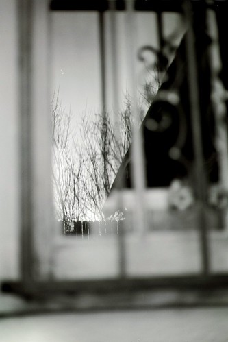
The other side of the same window as the picture, Dusk.
Took this picture 3 times. Each time I increased the shutter speed so that I could increase the aperature and reduce the depth of field. This was the 3rd picture, the one with the widest aperature, best of the 3.
Yashica FX-3 Super 2000
Yashica lens 50 mm f/1:1.9
Kodak BW 400 CN
Shutter 250, f/1:1.9
March 2008
Friday, March 14, 2008
The Other Side of Dusk
Subscribe to:
Post Comments (Atom)


7 comments:
Now this, I quite like.
I like the diagonal line bisecting the framed portion. Good contrast, nice framing, interesting idea.
I think there is too much in the out-of-focus portion, but in general this is a nice and interesting photograph.
I like this a lot. I liked the focus. It isn't an easy picture. I had to work for it. It took me a second or two to find the in-focus part of the picture and it was a bit of a strange sensation. For that second or two it felt like my eyes weren't focusing, but it was just the searching for the focus in the pic. I like it.
Thanks for the comments, guys. Makes my day when people comment on the photos, to be honest.
The framing on this one was tough. I was worried about how much of the picture was not the reflection, which is the interesting part. I couldn't really frame it much differently taking the picture, though I could crop it afterwards. I still haven't decided if I should crop it. Interesting that Matt indicated it would be better with some of the out of focus surrounding part cropped, but Luke got something out of having to find the in focus part.
I was real happy with the diagnol that the dark part of the picture makes, Matt. That's the key to the compisition, I think.
Something went wrong, I posted this yesterday but it didn't post.
I took a shot at cropping this the way I think enhances its virtues and solves some of the negatives.
Interesting. I'm not sure. Common sense tells me your crop should be better, with more of the picture being the interesting part. Common sense also says that the wandering around the picture to find the center of interest that Luke describes is usually a bad thing. In this case, though, I'm not sure.
Thanks for taking the trouble to crop it!
I know I'm beating a dead horse, but my crop, good or not, was not about removing the "uninteresting" parts. It was about proportion. I thought the picture was too long. I tend to like squarer pictures.
Not much danger of beating a dead horse when talking about pictures.
I see. I'm leaning towards liking your crop better.
Post a Comment